Distinguish your brand from competitors with colour psychology

Colour psychology?! Yes, it’s an actual thing – colours have been found to have significant impacts on an observer’s emotions and responses, who knew?
The world is full of colour, from the foods we eat, to the clothes we wear. It's been estimated that our visual systems can distinguish about 2 million different colours and that most computer monitors can display about 16 million different colours.
With such an array of colour options you’d think that, when it comes to your branding, there are no bad choices - the rainbow in the sky is the limit. That may be the case In principle, however have you taken your company’s brand perception, its tone of voice, values and objectives into consideration when selecting your tones, tinges and tints? Read on to discover why it is good practice to do so.
Perception is the identification, interpretation and organisation of sensory information to represent and understand a specific environment or data. While perceptions can vary, colours are consistently perceived in the same way, and this is why it is incredibly important when selecting them for your brand. It could be the difference between a new customer immediately resonating with your business or encouraging a potential lead towards your competition.
The IDEAM guide to choosing a colour that is best for you
Ac colour wheel is a great place to start when choosing brand colours that best complement your business.
First invented in 1666 by Sir Isaac Newton after he discovered that white light is composed of a spectrum of colours, a colour wheel is used to understand how colours relate to each other, allowing harmonious and effective colour schemes. They also help in selecting colour palettes, mixing colours and making high impact.
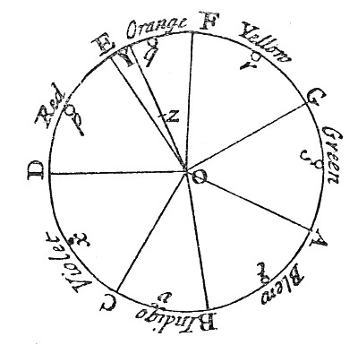
Today, a traditional colour wheel is broken into key colour groups.
Traditional Colour Wheel
Below is a breakdown of the different groups, how colours are made, and a summary of select colours including their meanings and perceptions.
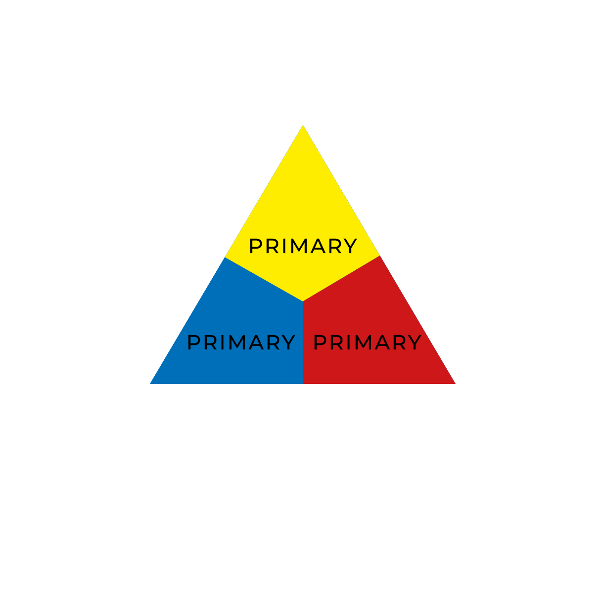
Primary - These colours cannot be created by mixing other colours together.
Red – The colour of fire, blood, anger, and sometimes of poisonous or dangerous animals. Generally associated with negative and danger-bearing emotions, but not always – red is also connected with the heart, the centre of love and passion.
Yellow – The colour of the sun, egg yolks, honeycomb, gold and some flowers. Yellow is usually perceived positively as it expresses self-confidence and can improve mood and self-esteem. However, it is also a less optimistic colour because it is associated with betrayal, jealousy, mental disorders and madness. It is also, alongside black, one of nature’s warning colours and as a result often appears in signage (wet floor, hazardous materials or temporary road signs to name a few).
Blue – The colour of the ocean, sky, blueberries, animals and insects. Favoured by many, blue is often viewed as a non-threatening colour that can seem conservative and traditional. It is seen as a sign of stability, security, reliability, peace and order, and it portrays feelings of calmness and relaxation.
Secondary - These colours are created by mixing two primary colours together.
Orange – The colour of autumn, fruits and vegetables. Orange tends to give us the freedom to be ourselves, impulsive, adventurous, risk-taking and independent.
Green – The colour of grass, trees, plants and emeralds. Green is seen by the human eye better than any other colour due to its spectral wavelength. It’s the most restful and relaxing colour to the eye due to its association with nature, growth, harmony, fertility, and freshness; however, it can also portray envy.
Purple (or Violet) – The colour of berries and various other foods. Purple has long been associated with royalty but has also been connected to rarity, piety, magic, and mystery.
Tertiary - These are created by mixing a primary colour and a secondary colour that are adjacent to each other on the colour wheel. The colours don’t have specific names, instead are referred to as red-orange, yellow-orange, yellow-green, blue-green, blue-purple, and red-purple.
What colours are your favourite brands? Has a lot of research gone into their colour selection, or are you thinking differently about their branding now?
We’re passionate about helping businesses succeed and would love to chat more and help you choose the colours that are right for your brand. Give us a call on 0131 516 8504 or email us at hello@ideam.co.uk so we can arrange a date for a cuppa.